To make better games, I’m a big believer in the value of learning the fundamentals, even if they aren’t directly related to game dev. You can elevate your game dev skills using the principles of design and art. Go beyond the amateurish, to something that is professional and powerful.
Take animation, which is more than a century old. My go-to bible is The Animator’s Survival Kit, an absolute classic by an award-winning veteran. When people ask for quick tips, I also recommend Disney’s 12 Principles of Animation. Even though these guides were written before computer animation became ubiquitous, their principles apply regardless of the tools you use.
I often see people making games, putting a lot of love and effort into it, but the animation is lifeless and basic. If only they applied some basic animation principles, this could look so much better! Well, now I’d like to show how to do this, using a basic, side-scrolling platformer character example.
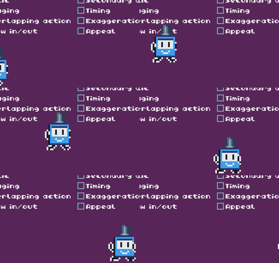
Let’s take a basic, pixel-art side scrolling character. This is Ticcy, the mascot for the TIC-80 fantasy console:

Giving Ticcy a basic walk and run animation might look something like this:
…and Ticcy has a hat, just because
And this is fine, to be honest. But let’s apply some of the animation principles, and see how much this can change.
Squash and Stretch
If something is accelerating, it should stretch out in that direction. If slowing down, it should squash. This helps highlight the motion and give objects a sense of weight as they move. Here we apply squash and stretch to Ticcy’s jump:
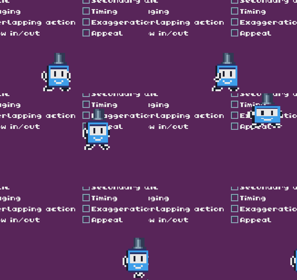
It’s cartoony when applied to something that should be rigid, but it highlights the jumping movement. And it’s dead-simple to apply - scale the character in the direction of the movement.
One thing to note, for realism, it is important to preserve the volume of the object. When we stretch Ticcy vertically, we also squash horizontally, so the total area of the sprite stays the same.
Anticipation
Also known as antic, this is the addition of an anticipatory action before a big action, so the action feels even bigger and impactful. A common example is a character winding back before taking a swing with a weapon. Here we apply an antic by making Ticcy do a squat before jumping:
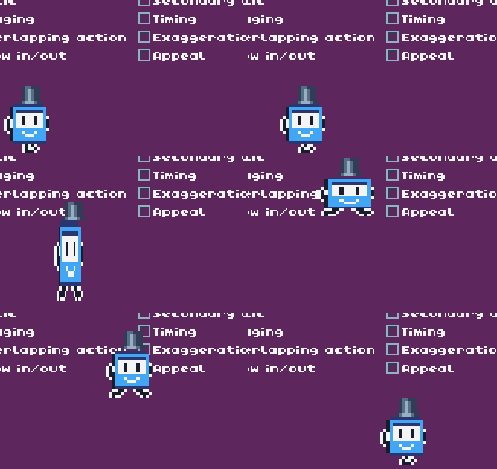
The squat is very basic as we are just using a squash, but we could make it look better by animating frames for it. It makes the jump seem bigger by making it feel effortful.
Antics are hard to use on player characters because it slows down the animation. They are great for enemies though, letting the player read their actions, so it’s a key technique.
Staging
Staging is the idea of setting up the stage, or scene, to better focus the most important action. An exaggerated example is speed stripes, common in anime, which focuses the action on the character.
This is not something we can easily control in games, but there’s still a lot we can do. We can use environment art, shadows, and use camera follow techniques, to put the player character in clear focus. We apply this principle by adding an attractive background, making Ticcy stand out:
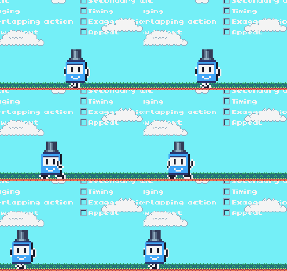
We’ve also added a ground layer, so Ticcy is no longer floating in a void.
Follow Through and Overlapping Action
Objects in the real world have inertia. When they start or stop moving, parts of that object will lag behind or continue along the previous trajectory. Think about hair or clothes on a moving character, which will flutter and bob around independent of the character. This makes things look more realistic or lively when exaggerated. Here we apply by making the hat move separately, following physical laws:
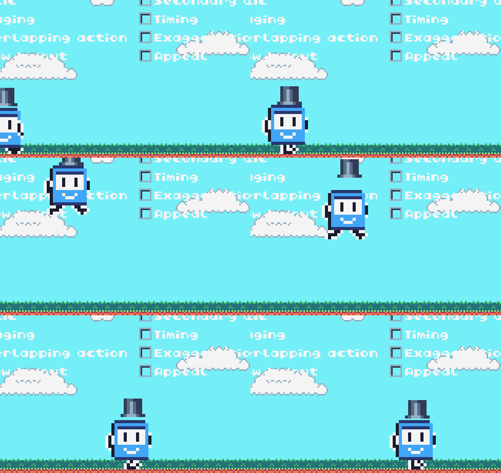
By adding a hat that is precariously bouncing up and down as Ticcy moves, it adds to the comical character.
Slow In and Slow Out
Objects in the real world don’t start and stop moving on a dime; it takes time to accelerate and stop. So when an object starts moving, it should slowly speed up, and so on. We can use this principle to show the weight of the object - the more we apply this principle, the heavier the object will seem. An object with no acceleration time will seem weightless. Here we apply by having Ticcy’s run start at a slow pace, and gradually speed up:
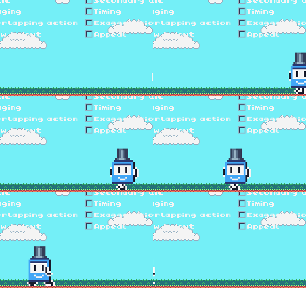
This example is exaggerated, but when applied to games, the effect is keenly felt.
Arc
When objects in the real world move, they do so in a well-defined arc following the laws of physics. Something flying through the air will follow a ballistic arc due to inertia and gravity. When objects don’t move in such a natural arc, it will feel out of place. Humans are great at spotting such discrepancies. We are trained to do so to perform challenging tasks like catching a ball, but this is subconscious.
Animators need to be aware of such motion arcs, but in game dev it is often the opposite case: it is easy to produce natural arcs in games. Take the platformer jump arc for example. One of the simplest ways to implement a jump is to add a y-velocity to the character, and apply gravity. This naturally creates parabolic arcs. But let’s step back and consider how we can be more intentional about jump physics. What kind of jump arc should we go for? How should it look, and feel? What is appropriate for the kind of game being made?
Take Mario for example. The games have non-trivial jump physics. You can jump higher the longer you hold the jump button. You have limited air control, and the falling speed also feels a bit floaty. Even different games within the Mario series have subtly different jump arcs:

This is totally something you can and should control in your games. You can design a unique jump arc to achieve a specific game feel. We may create a non-natural arc, but intentionally, and for a specific effect:
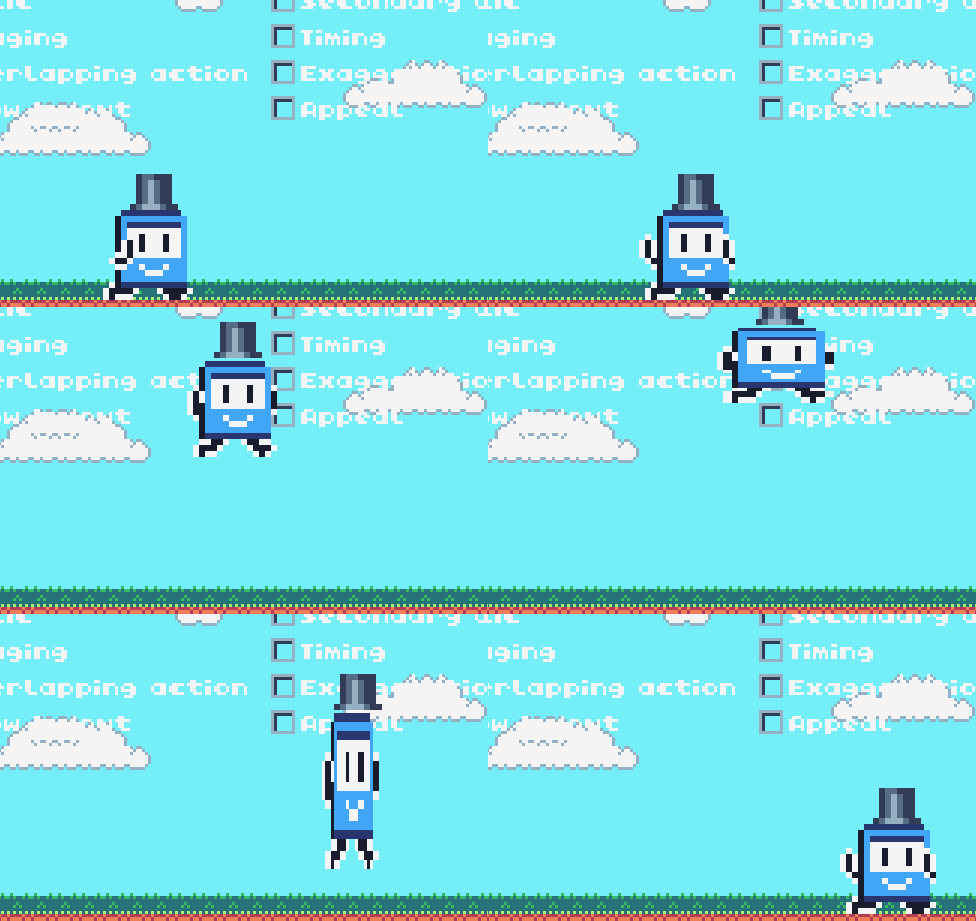
Instead of the basic parabolic arc, we make Ticcy reach the top of the arc faster, hold a bit, before falling down rapidly. This creates a squared-out arc, and it seems like Ticcy’s cartoonishly trying to stay in midair. The antic and squash effects we added earlier enhances the effect. This has gameplay effects too; you could imagine this makes it easier to jump over obstacles, for example.
Secondary Action
This is where we add actions to the character, in addition to the main one (like running/jumping). For example, a character talking or making facial expressions as they are moving about. This adds to the personality of the characters, and makes them seem more alive. They are no longer dumb automata that can only do one thing at a time, or what the player controls them to do.
We see this a lot in games already. Consider run-and-guns, where - as the name says - characters can shoot while running around. This requires animating the upper and lower bodies separately, so it’s a familiar technique for game devs. I would encourage adding more secondary actions, to make characters even more alive. Here we apply this principle by adding a blink animation, and also a mouth open facial expression when Ticcy is in the air:
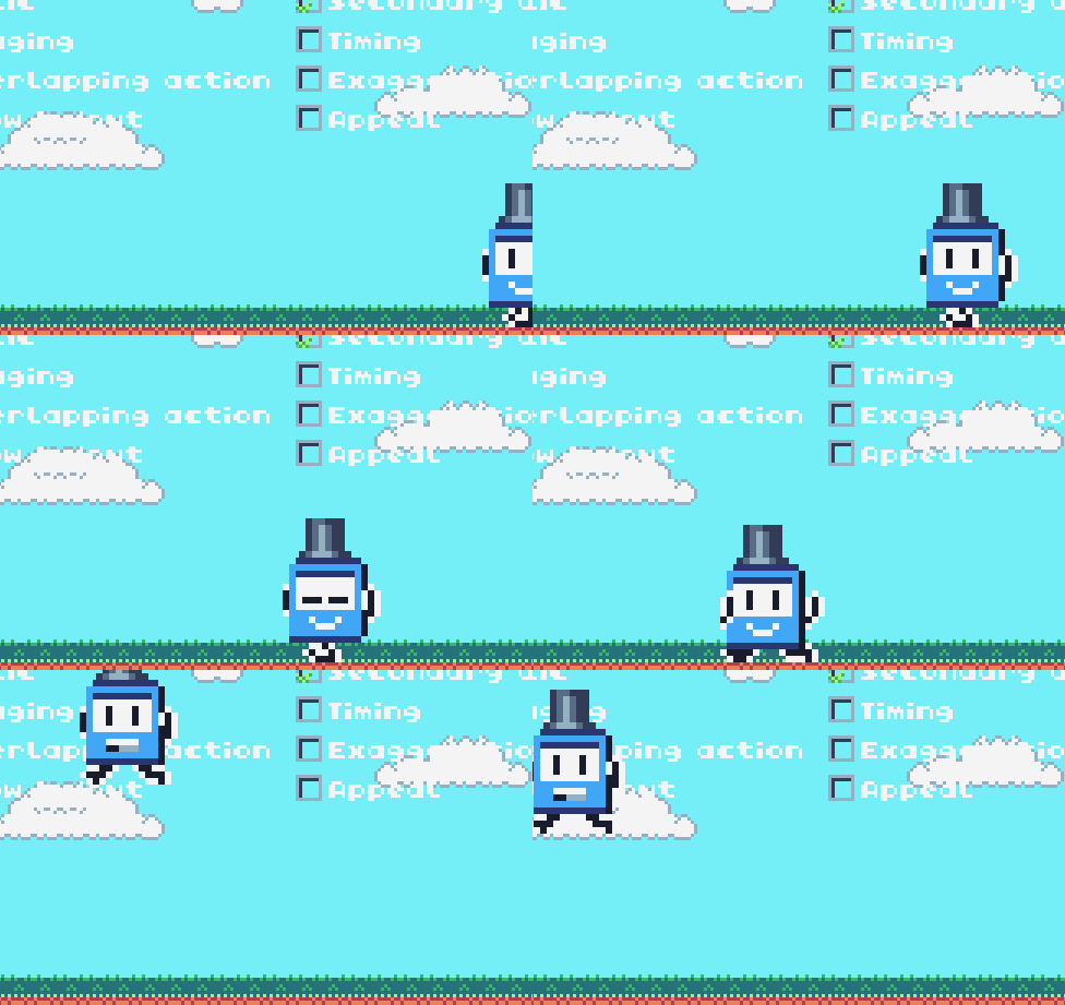
This example is incredibly subtle, and you may not even notice it if it wasn’t pointed out. But it definitely adds to Ticcy’s character. You might consider adding things like idle animations, which are great for giving lots of personality.
Timing
Timing refers to how many frames an animation should have, to make it seem faster or slower. Slower moving objects, especially when reacting to forces, will seem heavier. This is something that game devs don’t have to worry about, since computers handle timing for us. There is however one thing that game devs often neglect, but is incredibly powerful for animation: easing.
Easing refers to functions that change the rate at which a property changes. We can apply it to motion among many other things. In the context of motion, most games just use a constant motion, or simple acceleration. But we can go so much further than that, to achieve cool effects, like make things look bouncy, wobbly, or feel floaty or aggressive. One simple way we apply it here is to add an elastic skew animation when Ticcy suddenly stops:
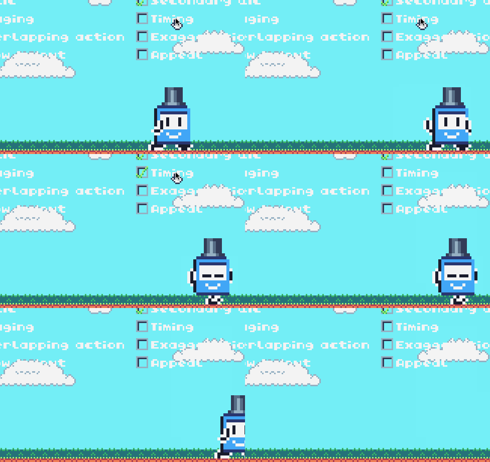
I mentioned earlier that objects starting and stopping on a dime is unrealistic. Here with an elastic easing function, we can stop Ticcy on a dime, but give the illusion of inertia. The body bends forward, before snapping back and forth. It’s a cheap way to make something that should be unnatural feel natural, as well as add more character to Ticcy. Perhaps Ticcy is made of rubber?
Exaggeration
In animation and games, we have the luxury of making things unrealistic and larger than life. We can exaggerate motion and go big for emphasis and effect. You’ve seen this in particularly comical animations from Warner Bros or Japanese anime. Think of eyebrows popping outside the face, comically enlarged body parts and so on. Here we do just that, by giving Ticcy a really big, disproportionate thumbs-up gesture:
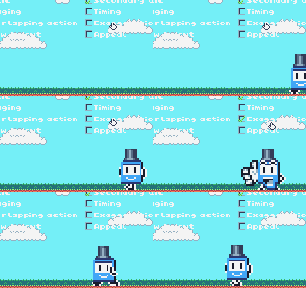
This is a great way to give characters big personality and highlight their actions. In game dev it is a technique that is underutilised. 3D animators avoid it because it’s hard to deform models. 2D animators also avoid it as it can be expensive to apply. But because it makes characters so memorable, it’s definitely something you should consider, as animators Johnathan Kim (Skullgirls) and Paul Robertson (TMNT: Shredder’s Revenge) write in this great article.
Appeal
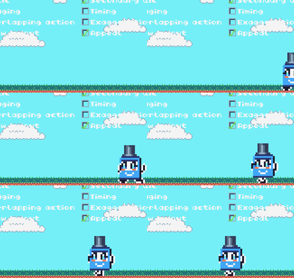
Appeal is a hard principle to describe; some say it’s analogous to charisma in an actor. We make protagonists likeable by giving them symmetrical features. Or we make villains terrifying with sharp, harsh angles. Beyond how a character looks, appeal can also apply to the way they move.
Ticcy’s character design is already very appealing. It has simple features and a very enlarged face that is almost the size of the body. This reads cute and pleasant, exactly how making games on the TIC-80 should feel. Can we take it even further?
Final Thoughts
I hope these techniques have inspired you to spice up your game characters. Every demo shown here is available in this interactive page: https://cxong.github.io/tic-80-examples/character-animation
Let’s see your cool animations!
