Once upon a time I made a few 3D games, but these days I make exclusively 2D games. This includes both games that take place in a 2D space, and the artwork is made using 2D techniques. I believe it is easier to make a good 2D game than a 3D one, both in terms of playability and looking great.
While 3D definitely has its advantages - there’s nothing quite like the immersion of a first-person perspective, and 3D models can be infinitely oriented - overall I prefer 2D much more. Here are my reasons:
Easy to Understand
>
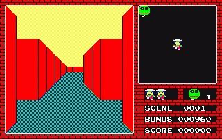
Hard to believe there was actually a 3-D Bomberman (right), released one year later
With the notable exception of VR, most games are played on a 2D screen, so it is natural to present games in a 2D plane. Humans have thousands of years of experience mapping things onto 2D surfaces; most maps are drawn on a flat surface (and it’s also why most maps of the world lie).
Even outside maps, humans often think of spaces in 2D terms, as we still live in mostly 2D spaces. Our towns, cities, roads, are all 2D. There are some 3D spaces - shopping centres for example - but they are a pain to navigate, since moving vertically is much more difficult than along a flat surface. In a sense we are a living organism that inhabits 2D spaces (and seldom layered on top of each other), unlike marine life for instance, which could be said to truly live in 3D.
Because of this deep cultural and evolutionary experience, 2D is easier to understand, easier to navigate, and easier to play in.
No Lighting / Shading
3D almost always requires a shading model and lighting sources. With some exceptions, such as wireframe rendering, you need a shading model to see the different surface normals. Therefore the most basic 3D scene requires lights and surface materials in addition to models.
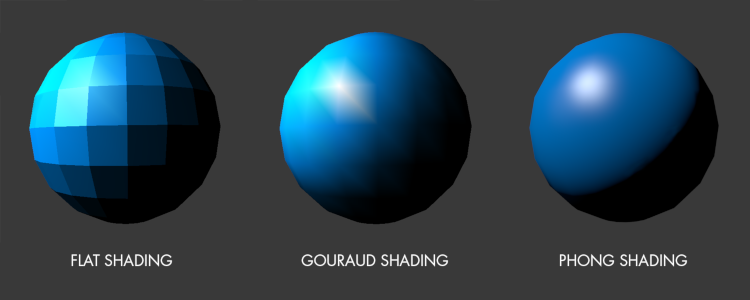
Not so for 2D scenes. Even some of the most complex 2D scenes can be boiled down to 2D sprites placed around the scene and drawn in a certain order. The sprites can be painterly, pixel art, or any kind of style, and they will look just as good as the artist can make them. This gives artists maximum control, with little in between the artists’ pen and the screen.
This doesn’t mean that one doesn’t need to think about lighting however. Making a 2D scene look great requires thinking about the principles of lighting, and the art team still needs to decide how the scene will be lit, but this is manifested in terms of how to draw the sprites.
https://www.pokecommunity.com/showpost.php?p=8884279&postcount=37
But this is where artists can use their training in visual art to make the scene really pop, and furthermore the flexibility of 2D art allows them to achieve styles that are non-realistic yet highly stylised.
Cheaper Art
3D art has a higher quality floor. Barring super abstract art (such as Unity capsules), a basic 3D character typically needs hundreds of triangles, rigged with a skeleton and animated, and skinned with some materials. It also needs to meet some minimum quality criteria such as the feet meeting and not sliding on the ground while walking/running, and looking good from multiple camera angles.
http://ithare.com/graphics-for-games-101-asset-pipeline/
By contrast, the simplest 2D art is ridiculously cheap. A cheap run cycle could be 3-4 sprites. And although 2D art doesn’t scale nearly as well as 3D, remember that if the game is played in a 2D world, it doesn’t need so many orientations, so for most games, the art budget remains cheap.
![]()
No Camera
There is so much work involved in getting a 3D camera right that it can fill a book. The position of the camera, field-of-view, what the camera is attached to, who the camera follows… get any of these wrong and you can make the player disoriented and even motion sick. Early 3D games ran into all sorts of pitfalls with cameras, such as having things block the camera’s view of the player, or randomly zoom in and out to avoid such things blocking the view. Sometimes the camera might end up in an unexpected location and see unintended things, like parts of the level not modelled, or that the player shouldn’t be able to see.
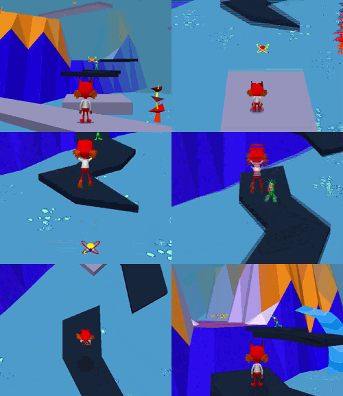
Compared to 3D cameras, 2D cameras are much simpler, if it needs a camera at all. While there is a lot more to 2D cameras than most people realise, it is a lot simpler to set up, and a lot harder to get wrong. Even the simplest follow camera often does the trick.
Hybrid Approaches
It may seem like I’ve been dunking on 3D all this time, but I have great respect for it and acknowledge there are many places where it makes more sense than 2D. What’s more interesting though is how we can mix 2D and 3D techniques to achieve unique effects.
2.5D
Over the years people have used the “2.5D” term to mean different things - some variation of not-quite-2D-or-3D - but I’m referring to a game that is played in 2D, but contains 3D art. For example, using 3D models in a 2D game, or by adding depth and parallax to something that is still essentially a 2D game.
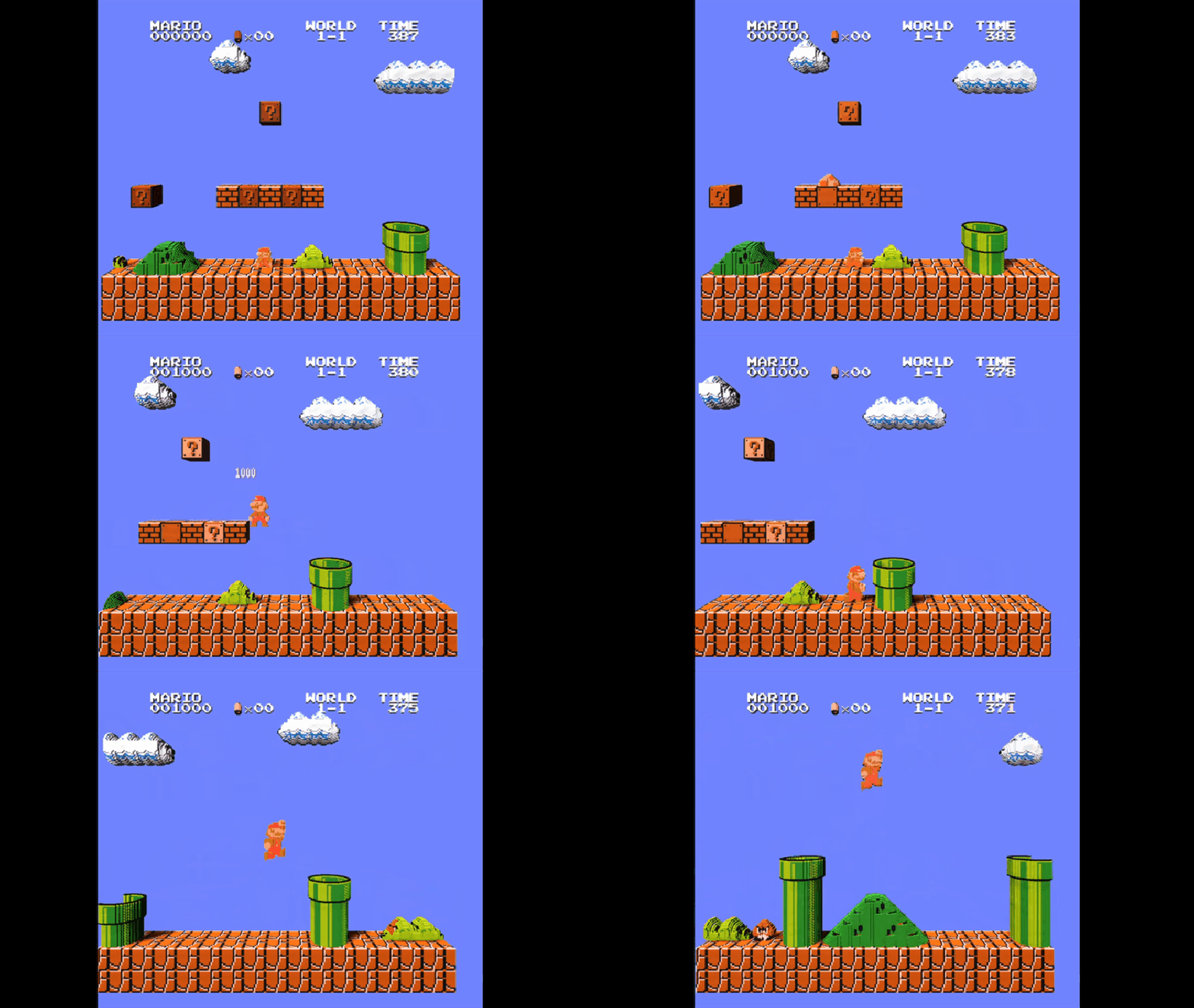
This technique has been used many times before. The overhead GTA games had 3D buildings to give a sense of scale. Since the early 90’s, fighting games have experimented with adding depth to the stages, using techniques like parallax scrolling and sometimes true 3D, even as the game is still played on a 2D plane.
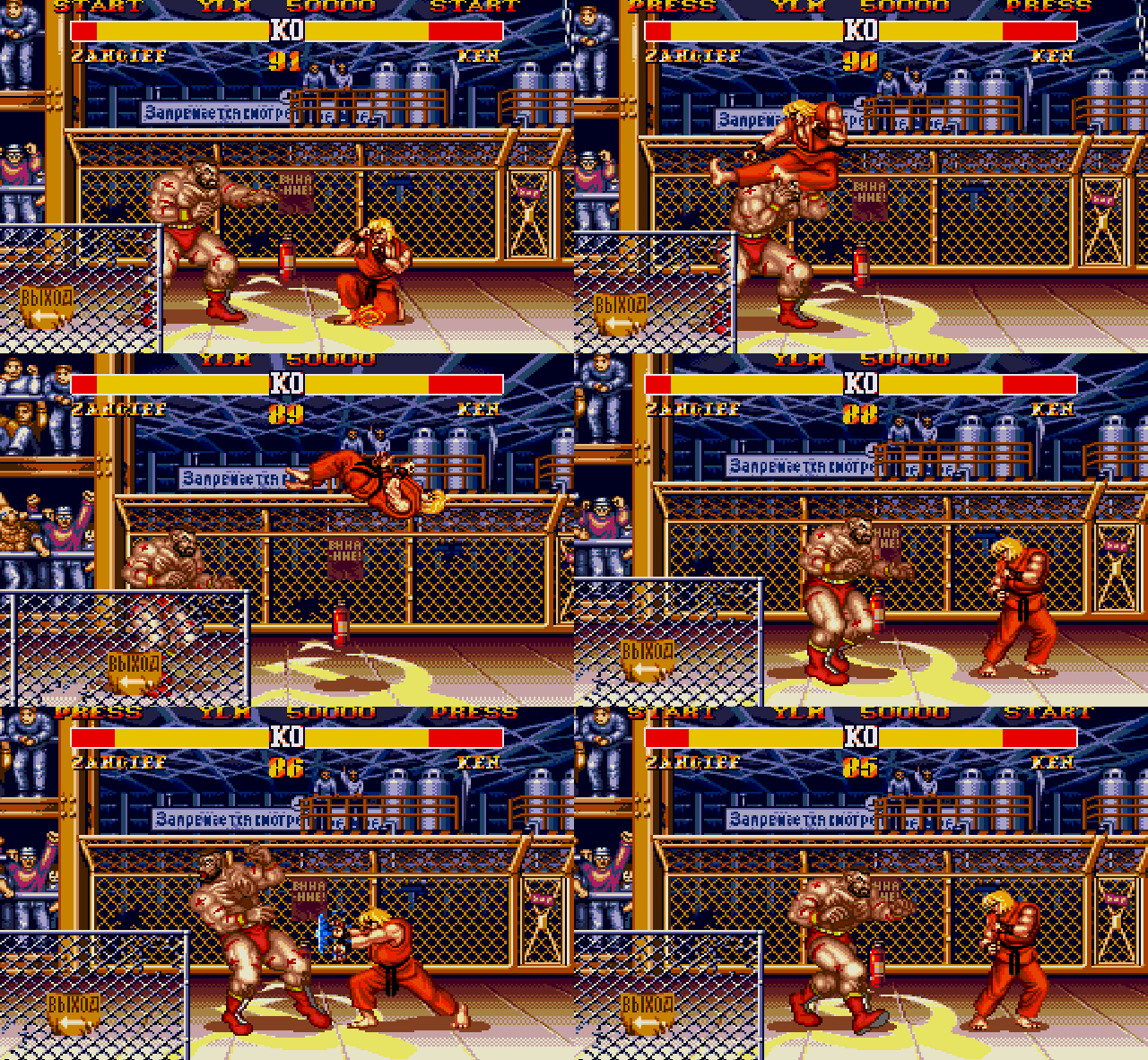
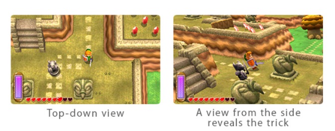
It is a powerful technique but care must be taken so that the 2D and 3D elements don’t clash. Sometimes weird tricks are required to get the 3D part working well too.
Sprite Lighting
One big advantage with 3D is that with a lighting and shading model, you can show dynamic lighting effects, which really gives a sense of depth and solidity to the scene. Without lighting, 2D environments can feel static and flat.
But if you consider 2D sprites as flat textures, there’s no reason why you can’t use texture maps and shaders on them as well.
These techniques are getting incredibly popular, and the results look fantastic. You can use lighting to add atmosphere, do environmental storytelling, or add depth that is otherwise very hard to do in 2D.
Games like Graveyard Keeper use sophisticated lighting systems with pixel art
Unfortunately these neat effects don’t come cheap - they can multiply your art budget, and may require special tools. Dynamic lighting should also be used with caution, as they can ruin a carefully-crafted look that you may have aimed for with a well-designed palette.
2D Skeletal Animation
Animation is one of the most expensive parts of a 2D art pipeline. Things like increasing framerate or adding the number of directions can easily double your precious art budget. But this is only because traditional 2D animation is done frame by frame. Nowadays animation extensively uses tweening - getting the computer to draw the in-between frames given parameters like start and end point of motion.

This is easy for simple animation, such as motion, rotation and scaling, but characters are much harder because of all the different body parts and poses. To do this properly you would need to rig the characters: add bones, attach body parts to those bones and animate the skeleton. This is a technique common in 3D animation, but there’s nothing inherently 3D about it. You could use the same technique for 2D.
There are specialised software for 2D skeletal animation like Spine, but you could easily use a 3D modelling software like blender and either import the characters into your 2D game, or pre-render to a spritesheet, making it even easier to use. Dead Cells used this technique to great effect.
There are downsides though, as rigging represents a higher up-front cost, and unless you spend a lot of effort, there’s something lifeless about typical 2D skeletal animation - perhaps due to their overuse in cheap mobile games? Well-executed frame-by-frame animation gives you more artistic freedom. Still, there is a niche for 2D skeletal animation, and worth trying out.
