Recently I restored the font used in C-Dogs SDL to the one used in the original C-Dogs. The reason why they were replaced in the first place was because the original graphics weren’t open source, so I was looking for alternatives. A few years back the author of C-Dogs agreed to open source the original graphics, and I’ve only just gotten around to restoring the font.
But that’s not what this post is about! I want you to take a look at the C-Dogs font:
It’s actually a pretty neat font. Most of the letters are just 3x5 pixels (some wider or taller), but with a few tricks they look super legible for their size. Here I’ll show you some of the tricks used to make pixel fonts really legible.
Tom Thumb
Let’s back up a bit. While I was looking for a free font, I had some tough requirements. The font couldn’t be bigger than 3x5 pixels, otherwise the UI in the game will break. That’s a really small size to work with, and most pixel fonts struggle at that size.
Most pixel fonts are around the 8x8 size
I managed to find a contender in a surprising place; someone made some 3x5 fonts for use on PDAs, where screens could be 160x160 pixels total. The font was jokingly called “Tom Thumb”:
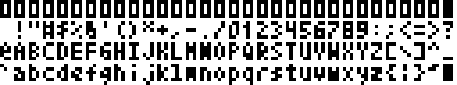

This was the right size, but it’s not nearly as legible as the C-Dogs font. Some letters are so compressed it’s hard to tell what they are without context (take a look at “M” and “N” for example). Tom Thumb, being made for a terminal, strictly needed to be monospace whereas with C-Dogs SDL we could have variable-width fonts. Here’s some tricks we used to enhance Tom Thumb:
Add Outlines
For games, you don’t really know where your text could end up. It could be over a dark or light background, coloured, or with a bunch of busy game objects moving in the background. A plain-white text will get lost over a bright background and so forth.
A really cheap solution is to just add an outline! And if you overlap the outline it doesn’t even need to add to the width of your font.

Use Greys
Before the proliferation of 4k displays, folks have come up with some clever ways to make screen fonts legible. Here’s a simple approach using antialiasing:

We can copy the same idea on pixel fonts and use some greys in the font to hint at curves.
Look at how the “o”s become much rounder, and the “W”’s shape is much improved.
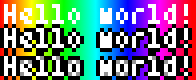
Make it Proportional
We didn’t get to this point with Tom Thumb, but since C-Dogs SDL can handle proportional fonts, why not use the extra horizontal space available? It can really improve wide letters like “W” and “M”.
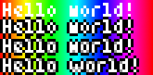
Here I’ve just replaced the “w” with one from C-Dogs. Doesn’t it look great?
If you’re interested in Tom Thumb, both the original and our enhanced version, you can find it here on OGA. It’s got a great range actually, with lots of Latin1 characters.
And if you’re making pixel fonts yourself, why not use some of these tips?